BLOG

Introduction
In today’s crowded digital landscape, your brand has just seconds to make an impression — and chances are, it won’t happen through a pitch deck or mission statement. It’ll happen through an interface.
The way a product looks, feels and responds tells a story. It tells users whether they can trust you. Whether you’re paying attention to detail. Whether you’re worth their time. That story is told through design. By design.
This isn’t just about “looking good.” It’s about building clarity, credibility and connection — fast. And that makes user experience and user interface design (UX/UI) one of the most powerful, often-overlooked levers in your brand strategy.

1. First Impressions Are Interface-Driven
What users see = what they believe
Think about the last time you visited a website or app for the first time. Before you read a single word, you formed an opinion. Clean layout? Fast loading? Clear hierarchy? You probably stayed. Cluttered? Confusing? You bounced.
Most users decide whether to trust a brand within seconds. Visual design, spacing, typography and motion all contribute to that decision. The irony? These aren’t always conscious assessments. They happen instinctively — like reading a room.
- Clear, visual hierarchy
- Readable typography and structured layout
- Consistent branding and visual cues
- Microinteractions and motion that feel purposeful
If you don’t invest in your interface, you risk miscommunicating your value — even if your product is great.

Images are processed 6×–600× faster than words. (Source)

Real brand experience happens when someone uses your product or site
2. UX Is the Brand Experience
Beyond logos and colors
Logos and color palettes are just the surface. Real brand experience happens when someone uses your product or site.
If your navigation is intuitive, your signup flow is frictionless, your tone of voice is human and your error states are forgiving — you’ve just delivered a meaningful, memorable brand interaction.
- Build trust through clarity
- Reduce support costs
- Turn users into advocates
Bad UX leads to confusion, erodes confidence and sends users elsewhere. Good UX keeps people engaged — and coming back.
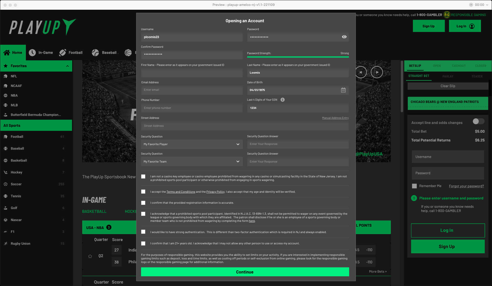
Working with PlayUp (2022-23), we streamlined their sign up process from 14 micro steps down to one consolidated step (enlarge )
3. UI Design as a Strategic Asset
More than just decoration
Too often, UI is treated like window dressing. But smart interface design positions your brand.
Minimalism can signal luxury. Bold visuals can suggest innovation. Friendly animations can make your brand more human. These are not accidents — they’re signals.
When I worked with PlayUp, a sports entertainment platform, their original signup flow felt generic and overloaded. It lacked structure, clear navigation and branding. So, I redesigned the onboarding flow to reduce the number of steps from fourteen to three, with a cleaner layout, intuitive progression and clear visual feedback. While I wasn’t directly tied into analytics, the design shift made the process feel more trustworthy and cohesive — helping users move from hesitation to engagement. Check out the case study here
Good UI doesn’t just “look better.” It shapes how your product is perceived.
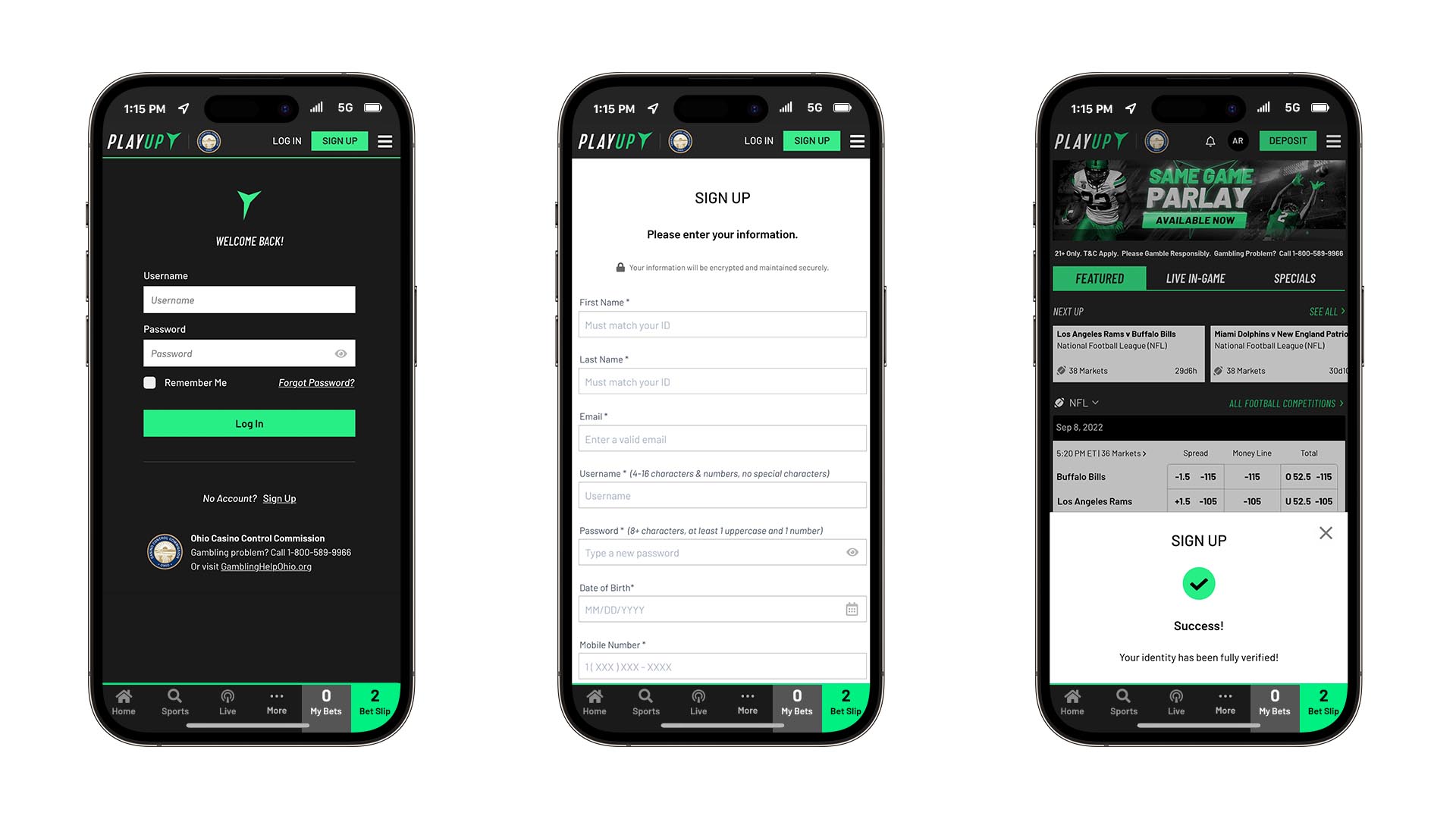
Redesigned PlayUp onboarding flow — reducing steps, improving clarity, and guiding users confidently from signup to verified access.